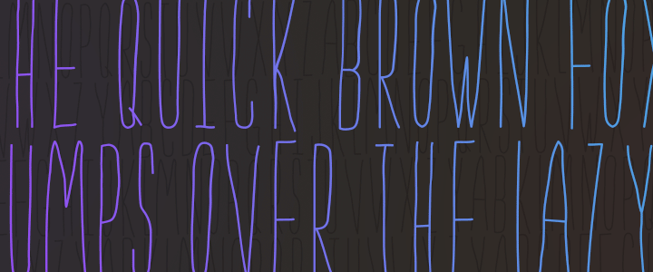
Fonts have always felt like a black box to me. The thought of creating a new one seemed like a task reserved for a select few with decades of experience, a deep knowledge of typography, and cumbersome, expensive software. Not me, I thought. I proved myself wrong by making my first font, Slenderman.
I’m working on a small design project that felt like it needed hand drawn type. I could have gone the route of using images, but that just doesn’t feel right on the Web these days. I want my web type to be scalable and maintainable. Using images for type is neither of those. It was clear that I’d need to either find an existing font that fit the style I wanted, or create my own.
I didn’t look around for existing fonts that fit. I jumped straight to creating my own. The project is a personal one so there’s no time limit. When I have that choice I love to let projects expand to as many different areas as they need to. This same project also led me down the path of building another small tool for working with HTML video subtitles.
I knew how I wanted the capital letters to look from the outset. I started by just drawing them out on paper. My first thought for the lowercase letters was to make them not match the style of the caps, but to be a complement to them. I though a cursive handwriting style would be a nice contrast to the tall, skinny caps.
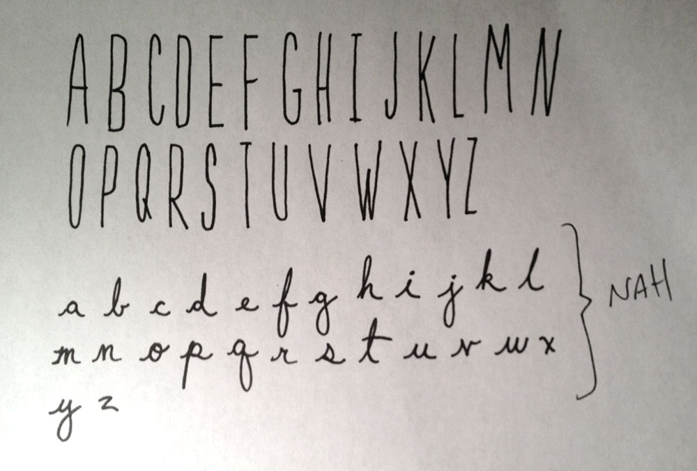
After drawing the letters, I scanned them and used Illustrator’s Live Trace to convert them to vectors. The cursive lowercase letters didn’t convert well. They lost a lot of detail, and just kind of turned into muck. It was clear they weren’t going to work out so I ditched them.
I went back to the pen and paper and drew a new set of lowercase letters as well as the numbers, punctuation, and assorted symbols. You can see in the drawing that the “@” and “&” are tough to decide on. I followed the same scan then Live Trace with these.
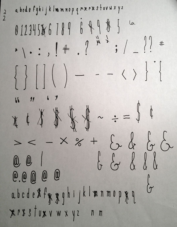
With all the characters drawn, scanned, and converted to vector the next step was to start refining them. All the charaters needed to have similar stroke weights, similar widths and heights, and a handful of other defining characteristics to make them feel like a family.
I started with the capital letters. They converted to vector really well. For them I mostly just needed to make sure each letter was the correct width and height. I also needed to remove extra, uneeded points that Live Trace had added during conversion.
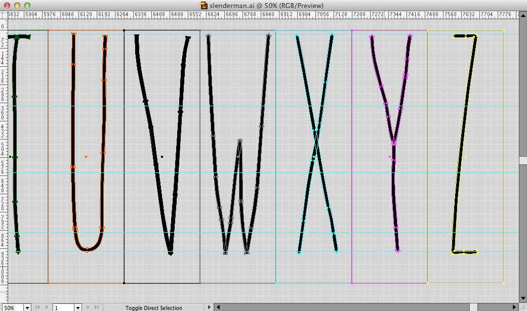
While I was refining each capital letter, I was bringing each into Glyphs Mini, my font editor of choice. It allows vectors to be pasted in from Illustrator. Once the vector is in Glyphs I could set the position and spacing. Glyphs also allows characters to be typed out in the edit tab to get a real feel for how each one interacts with the others. This allows for creating kerning pairs of characters.
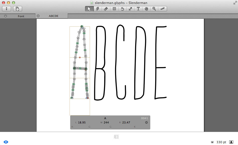
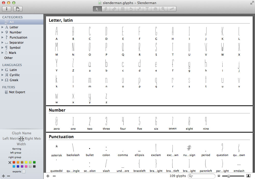
The refining process for the lowercase letters took a lot more work than the capitals. For each of the 26 letters, I needed to make the strokes narrower, and for a lot of them completely change the shape from what I had drawn. This involved manually moving the points that made up each letter. It felt a lot like the original vectors were chunks of rough granite that I needed to chisel down into their final forms. As you can imagine, it’s a long, slow process.
I followed the same process for the punctuation, numbers, and symbols. While I was refining the numbers, I did get a little overzealous. I ended up chipping away a bit too much off each one, leaving them very skinny. When they were next to other characters it looked like they were from a different family. This required me to go back and make each number a bit heavier. Lesson learned; compare each character to as many others as you can while you’re tweaking the vectors.
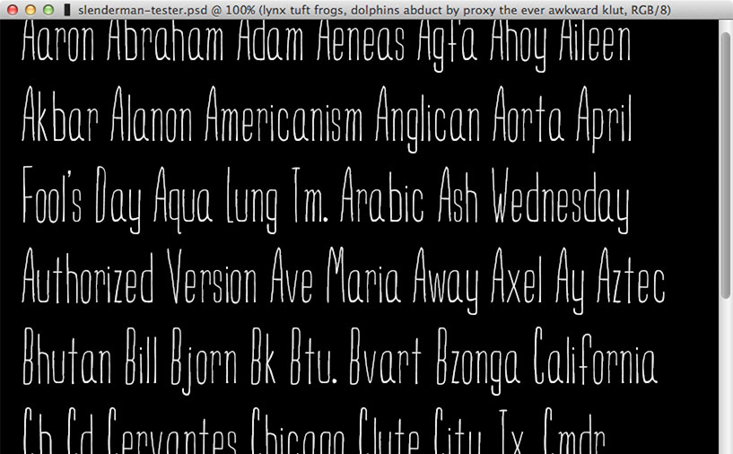
Glyphs Mini allows for exporting to the OpenType format. While I was adding characters I wanted to get a better feel for how they were working. I would export the font, install it and then open up a test Photoshop document. Seeing full sentences and different combinations of letters, numbers, and symbols is really key to determining if things are working. I could better see any issues with spacing and sizing and pick out pairs of characters that could use attention to kerning. Also, it’s a really great feeling to be able to use a font after spending so much time working with it.
This is very specific to users of Glyphs Mini, but I spent a few hours banging my head against the desk before I figured it out so I’m going to write about it in the hopes that I’ll save some other poor soul’s forehead.
Glyphs has components. A component is a Glyph that is made up of a base glyph. Example components are right and left double quotes and the ellipsis; made up of right and left single quotes and the period, respectively. When you open a component to edit, the base glyph is grayed out, it seems like it is uneditable. It also only shows the base glyph. In the case of double quotes only a single right or left quote is shown. For the ellipsis only a single period. For some reason Glyphs stacks the base glyphs on top of each other. The base glyph needs to be clicked and dragged to reveal the other base glyph(s) under it. I found this answer on the Glyphs forum.
Part two of the gotcha took longer to figure out. After I’d separated the base glyphs of the compenents, I spaced them, tested them with other characters in the edit tab, and exported like normal. Then I tried to use right and left double quotes and the ellipsis. Nothing would show up. I could tell the glyph exported because I didn’t get the usual missing glyph character and neither Photoshop nor TextEdit tried to replace it with another font. This seemed like one of those what in the hell?!/computer voodoo moments.
Cmd + Shift + D was the magic key combo that ended my confusion. Components need to be Decomposed before they can be exported properly. The option is available under the Glyph menu > Decompose Components. Once a component is decomposed it is no longer tied to a base glyph so it can be edited like any other glyph and it exports normally.
I’ve always felt like when I download a font that’s that. The font is done and nothing can be added or modified. This might not be the reality, but without a knowledge of how fonts are made, that’s how I’ve seen things. With Slenderman, I’m not aiming for it being “done”. I want to keep iterating and improving on it. All of the source files are available on GitHub. That means anybody can fork the repo and make any changes or additions needed. They can make new versions of it that fit their needs, or open Pull Requests to have their changes added into the main fork of Slenderman. I haven’t seen that before and I’m interested in seeing if anyone is interested in working on it.
Slenderman does not make me a typographer by any means. It did open up the possibilty though. Working on it has given me a greater appreciation for the skill and patience required to create the beautiful type that we use and often take for granted.
Thanks for reading