This is part of my “Realign 2020” series. In it, I document my process during a content and design realign of this site. I’ll update the site piece-by-piece as I post. The design and content will evolve through the series and beyond.
The fonts I’ve chosen for this site have run the gamut over the years. Handwritten, illustrated, web-safe only, monospaced, serif, questionable, and so on. The last few years I’ve leaned on chunky, sturdy fonts. Fonts that—to me—say; “hard work gets done here.” That fits my approach to design and engineering.
For this iteration, I wanted that same sturdiness. I also wanted more room to play. I wanted to use more weights than I have in the past and, when possible, I wanted to make things strange.
After a long search and plenty of playing with different faces, I’ve settled on a font that will serve the design and content well for at least a couple years.
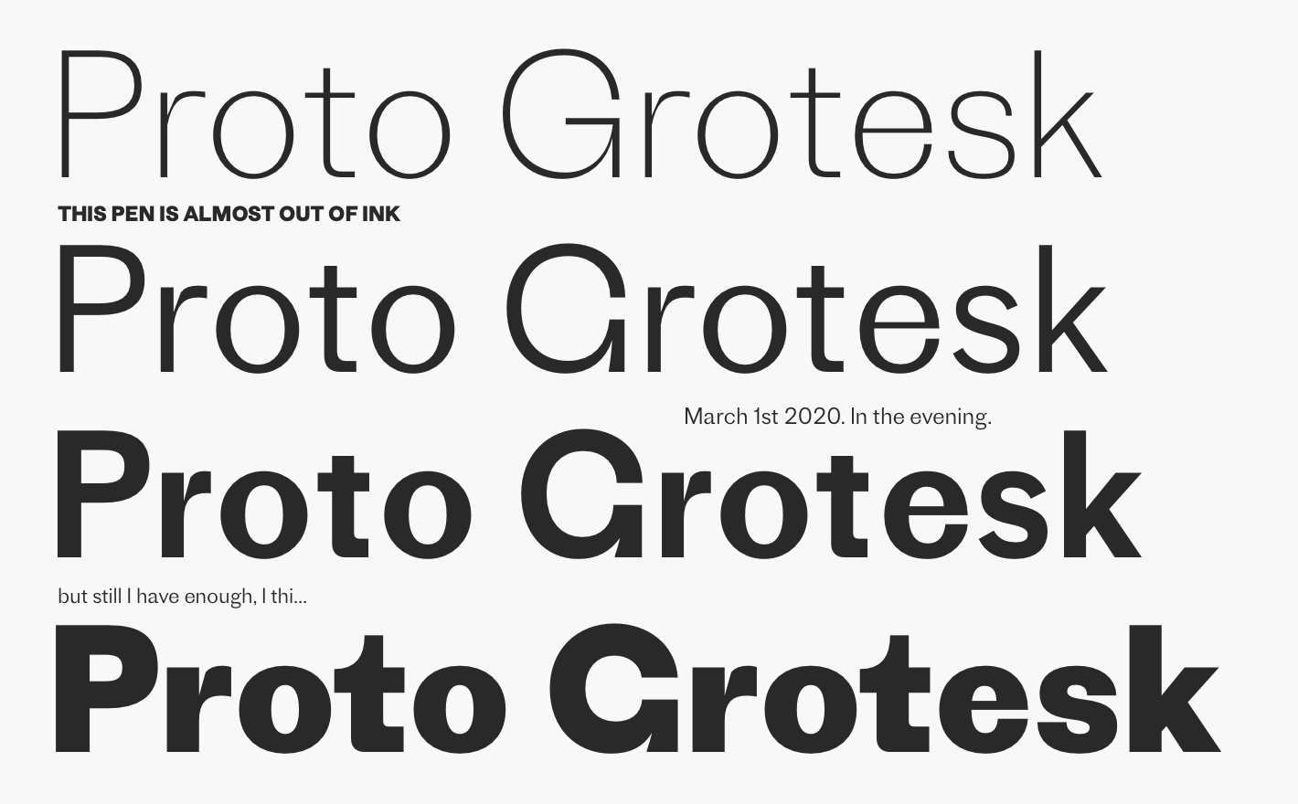
If you’re reading this on my site, these sentences are now set in Production Type’s lovely Proto Grotesk. I’ve chosen the light weight for the base body copy. The regular weight feels too heavy for large swaths of copy.
I’m using the bold weight for certain headings and navigation items. I have small doses of all caps here and there.
The extra light weight is coming in handy for blog post titles. I want those to be commanding without hitting you over the head as much as a bold or heavier weight can.
As I iterate, I’m looking forward to experimenting more with weights and sizes and styles. Proto Grotesk also has fun alternate numerals and other alt glyphs that I’m hoping to make use of when appropriate.
I learned about Proto Grotesk via Bethany Heck’s excellent Font Review Journal. A lot of what she detailed in the review is what draws me to the typeface. Its idiosyncrasies stick out enough to make it playful, without reducing reading comfort.
The designer’s description is a perfect summary of what I’m looking for.
…there’s no reason type can’t be both steadfast and peculiar…its posture is nothing less than sturdy and forthright. Proto Grotesk is strange but steady.
Production Type - Proto Grotesk
One detail I really dig are the little “flat feet”, as I’ve been referring to them. The lowercase “y” and “a” are the best examples. Something about that abrupt, a little too long bit catches my eye. I took cues from it as I was updating my logo. I’ll write about that in a future post.
Along with all that, I think Proto Grotesk just looks super cool. Sometimes that’s enough.
This was the most expensive font I’ve bought for a personal project. My bill was about $400 USD. That bought me all four weights with a desktop and web license. That’s a big buy for me, but it feels worth it and it’s cool to directly support a type design studio.
Production Type offers trial downloads of their fonts. Being able to try the font in design programs and in browsers made all the difference. By the time I clicked “purchase”. I’d been using Proto Grotesk in real settings for weeks.
Those trials also helped me experiment with other fonts and weed out ones that weren’t working. There were a few that looked great on Production’s site, but didn’t work in the context of my design.
I’ve used Typekit on this site for about eight years. It’s served me well, but I don’t want to load fonts from a third party anymore. I want to self-host. That was a smaller reason to go with Proto Grotesk too. Not that it’s the only font I could self-host, but it checked that box.
Because I’m self-hosting, I need to load fonts in a performat way. I spent time catching up on font loading methods. They move fast. Zach’s post “A Comprehensive Guide to Font Loading Strategies” is the place for that info.
I didn’t end up using one of Zach’s gold standards. I wasn’t ready to introduce JavaScript to assist in font loading. I wanted an HTML/CSS only approach for now. I have other performance improvements to make in the future, so I’ll revisit font loading then.
I went with a combination of approaches in the post. I’m using; standard
@font-face, font-display, and preloading. In the
head of my pages I preload two of the four weights I use.
<link rel="preload" href="/fonts/protogroteskweb-light.woff2" as="font" type="font/woff2" crossorigin>
<link rel="preload" href="/fonts/protogroteskweb-bold.woff2" as="font" type="font/woff2" crossorigin>
I don’t preload the regular and extra light weights because I don’t use them
in critical styles. They can load later via @font-face without
bothering anything.
From there, I include a standard @font-face rule for each weight
in my critical inline styles.
/* repeated for each font weight */
@font-face {
  font-display: swap;
  font-family: "protogrotesk-bold";
  src: url("/fonts/protogroteskweb-bold.woff2");
}
Using swap for font-display helps avoid a flash of
invisible content. There’s a slight shimmy when the custom font loads, but I
can deal with that.
I use CSS custom properties for font stacks. Again in my critical inline styles, I have a property for each font weight.
--font-proto-extralight: "protogrotesk-extralight", helvetica, sans-serif;
--font-proto-light: "protogrotesk-light", helvetica, sans-serif;
--font-proto-regular: "protogrotesk-regular", helvetica, sans-serif;
--font-proto-bold: "protogrotesk-bold", helvetica, sans-serif;
Declaring those stacks as custom props makes it so I don’t have to repeat myself. It also lets me type less when using each weight:
font-family: var(--font-proto-bold);A site’s typography is never “done”, only out there. I’ll keep making improvements and experimenting over time. If you’re interested in a before and after, I archived the site previous to this change at v6.tylergaw.com.
I’ll continue this series in a few days with “Realign 2020: Logo.”