
This is part of my “Realign 2020” series. In it, I document my process during a content and design realign of this site. I’ll update the site piece-by-piece as I post. The design and content will evolve through the series and beyond.
Eight letters form my first and last name. My title, 16. An ampersand for flair. That’s 25 characters that made up my logo. That’s how it felt. When I looked at my logo, I saw 25 characters standing alone next to each other. It felt like 25 solos. My goal with this iteration was to make those characters feel like an ensemble cast. A cast of characters that work together to convey more meaning than their underlying shapes could alone. This is what I came up with.
Sturdy. Dense. Heavy. Kinetic. Those are adjectives I wanted to use to describe my logo. I wanted this logo to feel like it was about to leap off the screen, burst through your wall, and crash onto your floor. I kept seeing a flag blowing from West to East. An object in constant, fluid motion. How a waving flag fits with dense and heavy, I don’t know either, but that’s where my head was. So, I started there.
I’ve written about this process before. In “A Logo Design Process” I wrote about iterating 2011’s logo into 2014’s logo. I went through a similar process progressing 2014’s logo to 2018’s, but didn’t write about it. My logo is like this site. I wrote in this series’ opener; “…I remember thinking this would be my last site…that I had a solid foundation that I could build on for a long time.” I feel the same about the logo. Since the 2011 version, I’ve worked with the same vectors and morphed them into the next incarnation.
This time around went fast. Odd fast. I didn’t sketch anything. I could see the chunkiness, the togetherness that I wanted in my head. I created a new Illustrator file and pasted the 2018 vectors in. Then got to work.
The first thing I did was remove the “New York NY U.S.A.” banner. I’m a New Yorker. I’ve been here for almost 12 years and I ain’t leavin’. But, that part of the logo didn’t feel necessary anymore. It’s been a fun, maybe a little corny, part of logo, but it was time for it to go to let my name and title have full focus.
From there, I reshaped each of the 25 characters point-by-point. There are 566 individual vector points. I positioned every one of them.
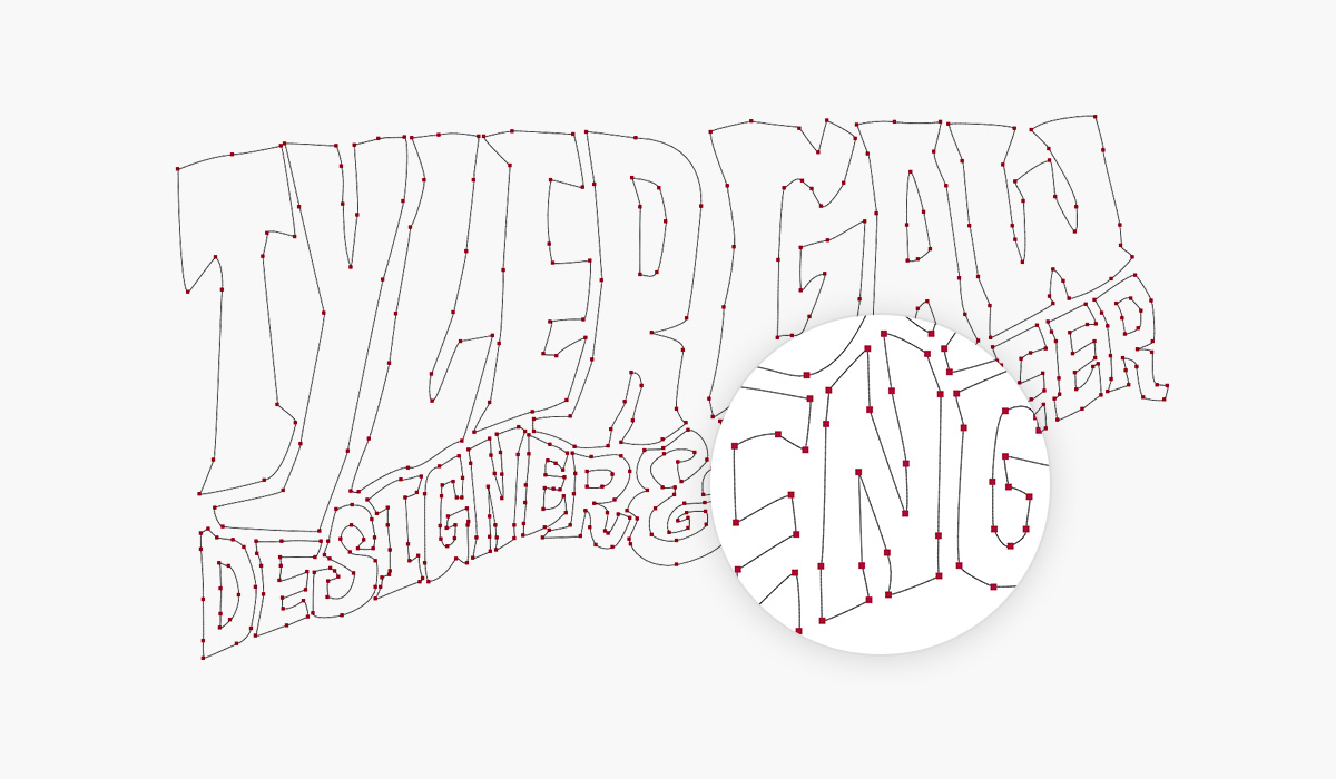
I started with the “T” and worked from left to right. The way I got the interplay I was looking for was by imagining the letters where physical objects made of clay. I also imagined the clay had a narrow forcefield around it. That meant one letter couldn’t meld with another, but it could push other letters to reshape them. This approach created interesting dents and divots. It smashed ascenders and stretched descenders.
To create a feeling of motion I made sure the line between my name and title didn’t go in one direction for too long. The line follows a flow created by the push and pull of the heavier characters.
The process stretched across three or four days. Those weren’t full working days. I would get a hour or so session in the evenings after the day job.
In “Realign 2020: Typography” I said I took inspiration from Proto Grotesk for parts of the logo. The descenders of Proto Grotesk on the “y” and “j” are what I pulled into the logo.
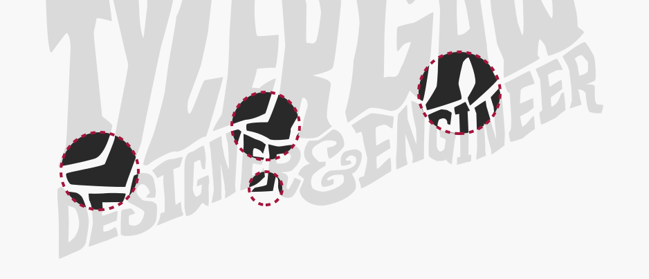
They’re not an exact copy, but a riff on the original. They were fun to work with because they gave another detail that effected neighboring characters. Because I thought of them as feet, I let that idea keep going. I imagined the “Y”, “R”, and “A” stomping on the characters of the title below them. Flattening their heads, squishing their bodies, and skewing the baseline.
When I look at the before and after I see something other than aesthetic improvements. I see personal progress. When you’ve been doing this work as long as I have, it’s easy to forget that you’re still capable of progression. When I look at 2018 vs. 2020 I can see how much I’ve learned. I’ve learned to use my tools better. I’ve learned how to see better. I’ve moved a couple steps closer to being able to trick computers into showing the full picture that I can see in my head. It feels great to know I’m still learning. Still growing. Still going.
I’ll continue this series in a few days with “Realign 2020: Color.”