Fun with HTML Form Validation Styles
Brass tacks: Demos; Style 01, Style 02, Style 03 and the code.
If you haven't heard already, the current HTML Living Standard or HTML5 spec has in it some super cool form validation. This is client-side form validation that is meant to remove some of the burden of writing validation with Javascript. If you've ever written form validation with Javascript I think you'll agree that this is a very good thing.
Using this new feature of html can be as easy as creating a form and within it creating an input with a required attribute. When the form is submitted, browsers that support validation will take the reigns and make sure that the required input has a value. If it does not, the browser will display a validation error message.
In addition to validating required fields, the form validation will also check to make sure inputted values match given input types. New in the Living Standard are quite a few new input types such as; "email", "url", "number" and so on. Check out the full list located at http://developers.whatwg.org/the-input-element.html#the-input-element.
Validation error messages
As of this writing, there are three browsers that both support html form validation and display error messages when needed. Browser support includes; Chrome 10+, Firefox 3.6+, and Opera 11+. Safari doesn't care about validating your forms and I haven't checked any versions of IE, maybe 9 or 10 support this? Each browser handles the styling of validation messages differently.
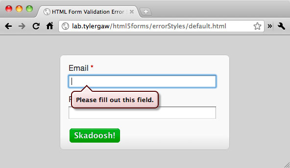
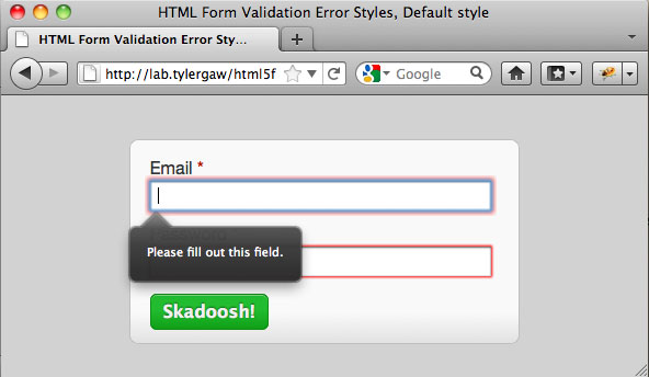
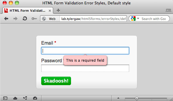
Of the three, only Chrome currently offers a way to apply custom styles to the message. Through non-standard, Webkit-specific pseudo classes you are able to style the messages in any way that floats your boat. That's what I'm focusing on with this article.
What about the other browsers?
That's a good question. I haven't heard anything about Opera, but it seems that the style and even handling of the error messages is an open discussion with Firefox. I did quite a bit of digging around in Bugzilla and in the FF 6 source code, but couldn't find any solid information on what the plan is. My hope is that a standard will emerge for styling the messages, but that could be far off.
The pseudo classes and markup
When I first started looking into if/how the error messages could be styled I quickly came across a "Rosetta Stone" in an article by Peter Gasston, http://www.broken-links.com/2011/06/16/styling-html5-form-validation-errors. In the post Peter explains the pseudo classes that webkit makes available to target the error message elements. He's done the leg work of digging through the Webkit source code to find this stuff, thanks Peter! To reiterate some of what is in Peter's article, the following are the classes that are available to hook into:
::-webkit-validation-bubble {}
::-webkit-validation-bubble-message {}
::-webkit-validation-bubble-arrow {}
::-webkit-validation-bubble-arrow-clipper {}
Each of those target a <div> element that is inserted into the DOM when a validation error is triggered. The markup looks like this:
<div -webkit-validation-bubble>
<div -webkit-validation-bubble-arrow></div>
<div -webkit-validation-bubble-arrow-clipper></div>
<div -webkit-validation-bubble-message>Error Message</div>
</div>
There are four more pseudo classes that were added as I was writing this article. These are currently only in the nightly builds of Chrome/Webkit and seem to just allow further control of the styling.
::-webkit-validation-bubble-icon {}
::-webkit-validation-bubble-body {}
::-webkit-validation-bubble-text-block {}
::-webkit-validation-bubble-arrow-heading {}
As of this writing and Chrome 13.0.782.112 these classes do not seem to have corresponding html elements. Only the bubble-text-block and bubble-heading contain default CSS rules and they are minimal and any CSS rules applied to these do not seem to affect any changes to the current validation error messages. We'll have to wait and see how these elements get put to use.
Default styles
A huge help when styling the messages is knowing the default styles that Chrome applies. Luckily the default Webkit CSS is available to peruse so you can see the exact properties that need to be modified. The default styles live here; http://trac.webkit.org/browser/trunk/Source/WebCore/css/html.css
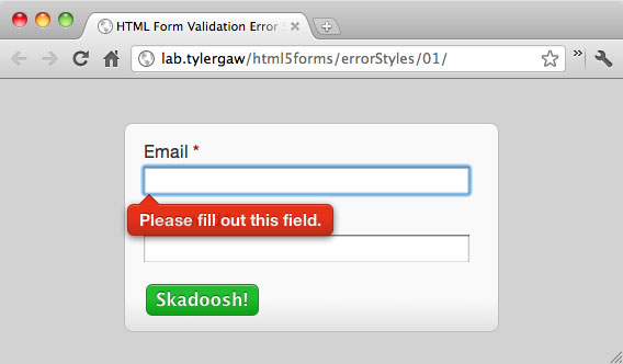
Demos
I set up three different demos using markup for a simple login form containing two fields. The first field is an email input that is required:
<input type="email" name="email" required>The second field is a password input that is required:
<input type="password" name="password" required>
The rest of the markup for each demo is nearly identical, differences include; using <label> elements for the first demo and some different structural elements for each.
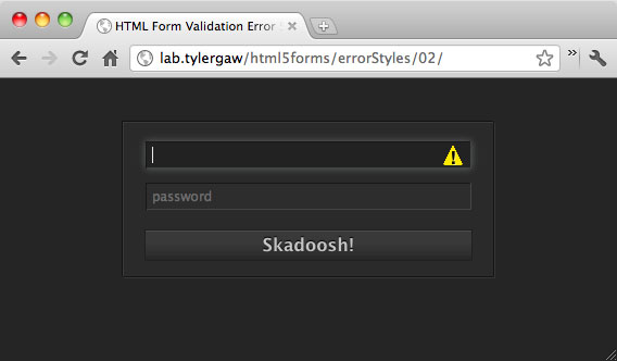
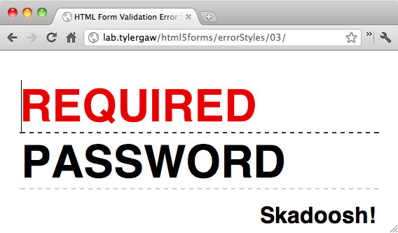
To really work with the message styles, I wanted each demo to have a distinct style from the others. Demo 1 has a kind of standard-looking style with error messages that are big, bright and bubbly. Demo 2 has a sleeker, higher-tech, control panel-y look with a slimmed down error icon with no text. Demo 3 has an artsy, Draplin-inspired, Futura-filled look that carries over into big-ole, text only error messages.
Fun with CSS animations
Something to keep in mind when styling the messages is that most any styles that are available in Chrome can be applied to the message bubbles, this includes animations. With demos 1 and 2 I created CSS animations to bring the messages into view. Since the message elements do not exist in the DOM until an error is triggered, the animations will not run until that time. So, in demo 1, to get that little shimmy and shake I'm using the following:
@-webkit-keyframes bounce {
0% {
opacity: 0.5;
margin-left: 85px;
}
25% {
margin-left: -35px;
}
50% {
margin-left: 50px;
}
75% {
margin-left: -22px;
}
100% {
margin-left: -15px;
opacity: 0.9;
}
}
The named animation is applied to the main message container;
::-webkit-validation-bubble {
-webkit-animation-timing-function: ease;
-webkit-animation: bounce 0.45s 1;
...
}
Demo 2 uses a similar, but less complex animation to slide the serious looking icon in from the left. This demo also introduces something new; custom error message text. The message text, among many other things, can be customized through the Constraint Validation API.
Custom message text with the Constraint API
The Constraint API is a new one in the HTML Living Standard, it allows you to further customize form validation using Javascript. The API is large enough for a full article to explain its features and how to use it, here I'll just point out the code used to set a custom error message.
var inputs = document.getElementsByTagName('input'),
len = inputs.length,
i = 0,
cur = null,
errMsg = '!';
for (i; i < len; i += 1) {
cur = inputs[i];
if (cur.getAttribute('type') !== 'submit') {
cur.setCustomValidity(errMsg);
cur.oninput = function () {
  if (!this.value || this.validity.typeMismatch) {
    this.setCustomValidity(errMsg);
  } else {
    this.setCustomValidity('');
  }
}

}
}
This is a fairly simple block of code, we start by looking at each input element on the page through a for loop, if the input is not a submit button we then use the Constraint API method setCustomValidity to apply the custom message of "!" that we stored in the errMsg variable. In my opinion that should be the end of the work needed, but there is more.
For some reason, when we set a custom error message with setCustomValidity that also removes the error checking from the input. If we were to stop here and submit the form, it would submit without triggering any errors. Starting at the line cur.oninput is the code needed to get around this oddity. The oninput event is fired each time a key is pressed that will change the contents of the input, each time the event fires we are checking to make sure the input has a value and that the value is valid according to the input type. The Constraint API makes available a validity property for input elements. This object contains a number of properties to determine the validity of the input, the one that we're using to make sure the value given is Ok is typeMismatch. If the input either has no value or the given value is not of the correct type, we need to set the custom message again. If a correct value has been entered we then set the custom validity to an empty string, which does a kind of reset on the validation. The input will then be validated normally again.
Going forward
This is definitely new, new stuff, and with all fun new things it will take some time before it can be used on a wide scale. I don't think that should be seen as a huge hinderance though. The Constraint API seems mature enough to be put into use right now, with the aide of a poly fill for browsers that don't yet support it. I haven't used it yet, but at least one exists already; http://afarkas.github.com/webshim/demos/demos/webforms.html. The error message bubbles are not really ready though. With only one browser supporting custom styles, and with no small amount of finagling needed to get them looking right, for now we'll need to keep creating our own error messages. I'll take it though, this is a huge step in the right direction and I can't wait for wider browser support and even more fun new things that will no doubt come with it.
Thanks for reading
This post is also available as Markdown. If you have thoughts or questions about it, find me on Bluesky, Mastodon, or email me@tylergaw.com.