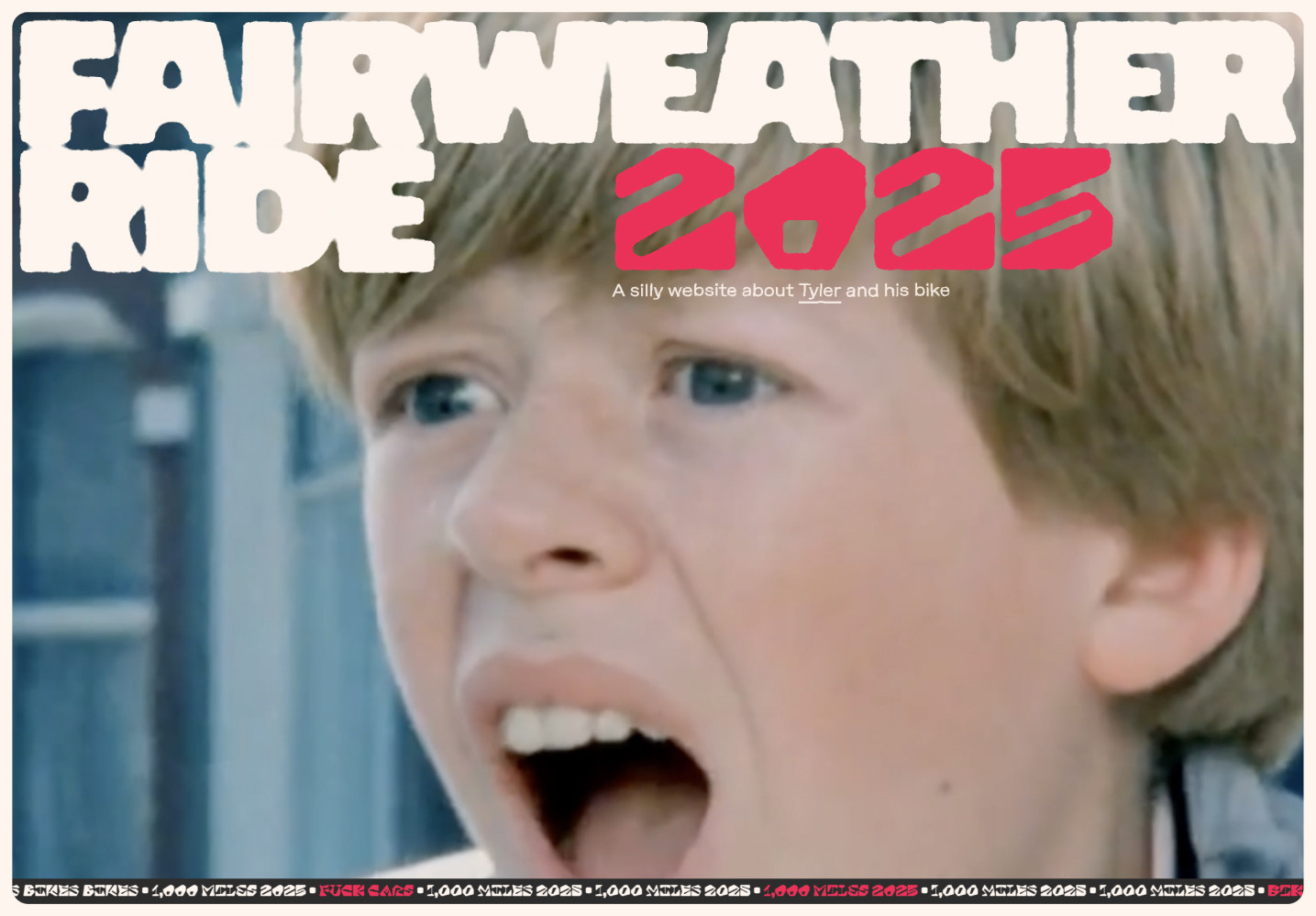
Fairweather Ride 2025
For 2025 I set a goal to ride 1,000 miles on my bike. I’ve been biking with some regularity for a little over a decade now. In that time, I’ve never set a yearly mileage goal. Only small monthly goals. Which, before this year, I only hit once. I decided it would be fun to work towards a goal way beyond what I’d ever done. Just to see if I could do it. And, of course, if I’m doing something like this, I’m gonna build a website for it.
Side projects are an exercise in fun. An opportunity to try out new things. Things that are slow, don’t scale, manual. Many things that would be deemed “not best practice” in day-to-day work. Following that, I started work on this site back in March and slowly picked at it for about five months. Remember, side projects can be slow. It’s been live since mid August. I started writing this post then, didn’t finish it, and finally getting back to it now, in November. So it goes.
HTML, CSS, and JS
Build processes have their place. I’m a fan of a lot of that tooling for other projects. This project setup, though, is on purpose, as bare bones as possible. This is a single page made with;
index.htmlsite.csssite.jsrides.jsonsplitting.js- and a handful of fonts, images, and a video.
I almost got away without a package.json and no external JS dependencies. I use a single dependency to make local development easier, live-server. Outside of that, these files get plopped on Netlify and run as they are. Just a good ole webpage. That is still 100% acceptable and good in 2025! Don’t let anyone tell you any different. The source is at github.com/tylergaw/fairweather-ride.
Typography
Like many designs, the backbone of this one is typography. From the start, I knew I wanted a design that used a lot of fonts. Too many fonts. Weird fonts. Fonts that clashed. I ended up using four; Optic, Method, ADHD, and Macabre.
Three of the four came from Future Fonts. It’s my go-to when starting a new project. The fourth, ADHD, is from capitalics. Can’t remember how I found them, but they do fantastic work. If you visit their site, and compulsively buy fonts, prepare to spend some money.
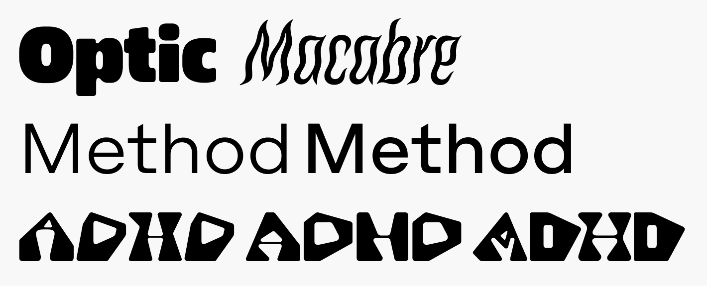
For the title, I wanted to do an ink-bleed style. Where edges of characters bleed into each other when they’re close, so I needed a chunky font. Optic has that nice balance of chunk, with just a touch of blobbiness to set the foundation. More on the ink-bleed SVG effect below.
Method is just a solid sans-serif. I use both the book and regular variants. It provides a balance to the surrounding chaos of the other, ultra-processed type and graphics. It doesn’t get away fully untreated though. For the intro text I apply an SVG filter to give it a worn, blobby look.
ADHD! What an oddball. I love it. In most cases, I cycle through three of its four variants; “hyperactive”, “distracted”, and “impulsive” with an @keyframes animation. Either always or on hover/focus to add to the overall movement of the design.
@keyframes adhd {
  0% { font-family: "adhd-hyperactive"; }
  50% { font-family: "adhd-distracted"; }
  100% { font-family: "adhd-impulsive"; }
}
ADHD Section Dividers
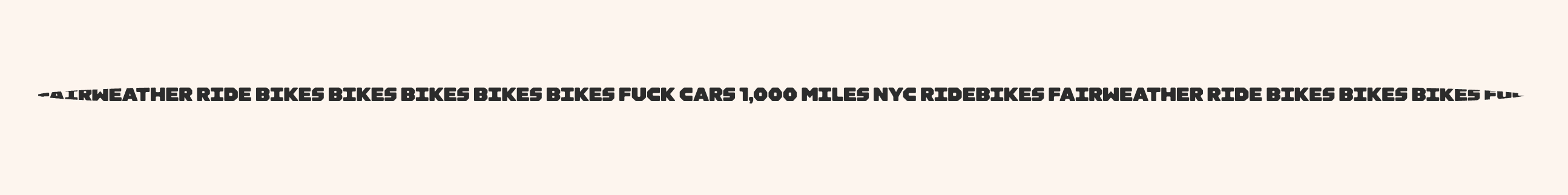
Here’s a fun detail. There are three blobby, shaky, dividers between sections.
These started as solid, grey lines. How boring. I didn’t want to use an image, or come up with some generated SVG. So, to create the semi-randomness, I’m using text. The markup for each divider is two divs with semi-random words and phrases related to the project.
<div class="divider" aria-hidden="true">
  <div class="divider-content">
    1,000 miles fairweather ride bikes bikes bikes fuck cars 1,000 miles...
  </div>
</div>
I use some base layout styles on the parent div to get the overall shape. Then use a combination of a transform and SVG filters to morph the text into animated blobs.
.divider-content {
  filter: url("#heading-blur") url("#edge-noise-animated");
  font-size: 1rem;
  font-family: "adhd-focused";
  transform: scaleX(1.25);
  white-space: nowrap;
}
ADHD focused works well here because it’s chunky. That way, as the transform and filters are mangling the text, it stays intact enough to still be visible. A thinner font would break down too much. More on the SVG filters below.
To illustrate what’s happening further, here’s a divider with the transform and filters disabled.
I saw Macabre on Future Fonts and bought it immediately without a use in mind. I tried it out in early designs for this, but it didn’t seem to work. Felt too much at home in a horror movie poster for what I was going for. Then I started working on section headings and, similar to the dividers, what I was trying felt too boring. I pulled in Macabre because it felt so far away from the rest of the design. This is a technique I use often to break out of a design rut. Just fling something far out to see what comes from it.
On its own, Macabre wasn’t doing exactly what I wanted it to for the headings. So I started breaking some rules. Stretched it vertically with a transform. Squeezed it horizontally with another. Then applied SVG filters to rough it up and animate it. The falloff to the right isn’t anything tricky. It’s the heading text repeated a few times, then manually sized, scaled, rotated, and transformed using nth-of-type to move each repetition into place.
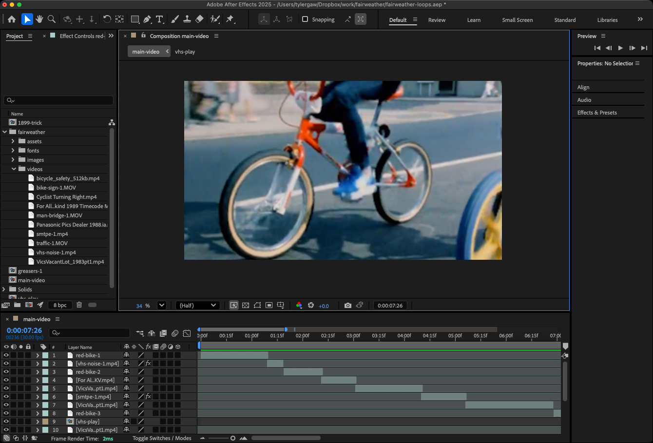
The Hero Loop
Somehow I’ve never designed or built a site that uses the common full width, full height hero video. As I was looking around for design ideas, I came across Gander’s beautiful site. It has one of those big videos on the homepage. That convinced me I needed one for this.
The immediate question was; “what’s the video of?”. I didn’t just want random clips of myself riding around Manhattan in jorts. Maybe that’s for a future project. I went to the Internet Archive and quickly found some fun clips of kids riding bikes from some PSA from the 80s. That helped set the tone. I tracked down a handful more videos of various lengths of bike-related material mostly from the 80s and 90s. I limited my search to older video clips to help keep a worn feel to everything.
I used After Effects to piece things together. There’s only a few “effects” in the ~25 second clip. I mostly used it as a non-linear editor. Largely because I’m most familiar and fastest with it. It was also nice to have the effects tools handy in the few cases where I needed them.
Strava Data
I track my rides with Strava so for my ride list and stats, I use their API. It works, but it kinda sucks. To request personal ride data from the API, you have to use a Bearer token. The only way to get that is to do an OAuth process. Strava doesn’t offer any type of app token for programmatic access, at least that I could find. There are ways to use their refresh tokens to make it work, but it wasn’t worth it for this project so, I do it manually. It only takes about 2 mins. I use Insomnia to generate the authorization URL. Go to it in a browser. Log in. Then copy the needed code from the bogus callback URL I have in place. Once I have that, I plop it back in Insomnia where I make the request to /athlete/activities. It’s dumb, but it works.
Once I have the data as JSON, I copy and paste it into the rides.json file. Instead of using fetch to get the data, I use a JSON module import assertion in site.js.
import dataRaw from "./data/rides.json" with { type: "json" };A request to get the data would work just as well here. I just reached for the import assertion first because it’s slightly less work. From there it’s nothing fancy. Some data cleanup, summing, formatting, and HTML string building. Everything happens in site.js.
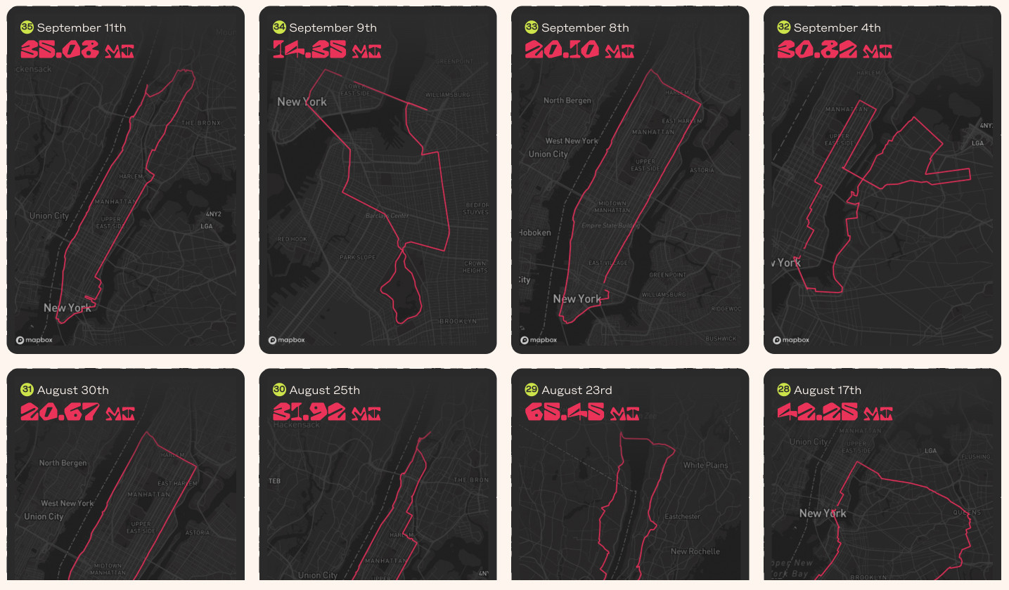
Ride Maps
The most interesting data about each ride is where I went. Luckily, the Strava API returns a polyline for each ride. The polyline contains the coordinates for the route I took, so I wanted to show that as a map. These don’t need to be interactive—zoomable, pannable—maps. They just need to show the route. Mapbox offers just the thing for this, the Static Images API. You set the src of an img element to the static API URL and include a few parameters, including an encoded polyline, and it returns an image. I knew this was a thing, but I hadn’t had a need for it until this. Pretty fun.
`https://api.mapbox.com/styles/v1/mapbox/${style}/static/path-${strokeWidth}+${strokeColor}-1(${encodedPolyline})/auto/${size}?attribution=false&padding=${padding}&access_token=${mapboxToken}`;The date and mileage aren’t part of the static map, they’re text elements styled and layered on top of the img.
SVG Filters
OK, this stuff is very cool. If you can’t tell, I’m not a fan of straight lines or smooth edges. Just in general, but with this design I wanted the absolute minimum of them. The last thing I’d want is for someone to describe the design as “simple and clean”. What an insult.
To avoid yucky straight lines, I’m using SVG filters to rough stuff up and in some cases animate it in a kind of squigglevision style. I started down this path while figuring out the ink-bleed for the title. I won’t go into the full background of filters here. It’s a deep pool that I don’t fully understand yet. I know just enough to piece a few together and fiddle with the knobs to get what I’m after. Basically, they let you do cool things to HTML elements via SVG and CSS that you otherwise can’t.
For the title, I start with standard-ish markup.
<div class="title-effected">
  <span class="title-fair">Fairweather</span>
  <span class="title-ride">Ride</span>
</div>
The extra spans are in place for other styling. I apply the filters to the parent div.
.title-effected {
  filter: url("#title-blobs") url("#edge-noise-animated");
}
The filters themselves are in index.html within a defs element. This creates the ink-bleed style:
<filter id="title-blobs">
  <feGaussianBlur in="SourceGraphic" stdDeviation="6" result="blur" />
  <feColorMatrix
    in="blur"
    mode="matrix"
    values="1 0 0 0 0  0 1 0 0 0  0 0 1 0 0  0 0 0 12 -5"
    result="title-blobs"
  />
  <feBlend in="SourceGraphic" in2="title-blobs" />
</filter>
When I was reading about the filters in this one, I needed to play around quite a bit. I ended up building a collection of CodePens for them if you’re interested in seeing different ways to do it.
With a few value tweaks and different layering of filters you can quickly build up very interesting effects. Ana is the go-to for knowledge and examples on how to use filters.
For the squigglevision, in the title and throughout, I’m using feTurbulence, along with animate and feDisplacementMap. I use this same one for most of it.
<filter id="edge-noise-animated">
  <feTurbulence
    type="turbulence"
    baseFrequency="0.05"
    numOctaves="3"
    result="turbulence"
    seed="0"
  >
    <animate
      attributeName="seed"
      values="0;20"
      dur="2s"
      repeatCount="indefinite"
    />
  </feTurbulence>
  <feDisplacementMap
    in="SourceGraphic"
    in2="turbulence"
    scale="3"
    xChannelSelector="R"
    yChannelSelector="B"
  />
</filter>
I have a few different blur filters for different text. They use the same filters, but with different values, depending on the size of the text. Larger text needs blurred more, smaller text, less. This is one detail of filters I wish was smoother. I wish I could pass attribute values to a filter via query param (or any other mechanism). Something like this:
filter: url("#general-blur?stdDeviation=5&type=discrete")The above code is not real. As far as I know, there’s no way to do this. You just have to make a copy of each filter with different values.
I have similar filters applied to text, the bike illustrations, and element containers. It helps give an overall handmade feel that I’m after. And it’s very cool to not have to make one-off graphics or introduce JS to make it happen.
As I hit publish on this, I’m at 940 miles for the year. The weather is turning cold quickly in NYC. My plan is to knock out the last 60 miles within the next week to make sure I get it done. 🤞
This post is also available as Markdown. If you have thoughts or questions about it, find me on Bluesky, Mastodon, or email me@tylergaw.com.