
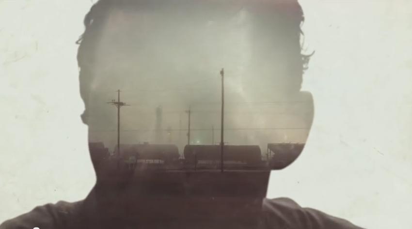
The opening titles to the show True Detective are incredible. CSS contains the building blocks necessary to create a similar style title sequence. I tried my hand it and came up with fun results. Here's the demo and the source code.
The first thing I have to do is issue the disclaimer. This is an experimental project. Things will most likely go wrong when you view it. I'm pushing on the browser pretty hard to get it to do things it maybe wasn't intended to. Also, due to limited suppport of CSS masking you'll only see the full effect in Chrome, Opera, and possibly Mobile Safari. The animations will work in other browsers, but things will look strange.
There's a whole lot going on in each shot of the TD titles. You should read the write up about it on Art of the Title. The main effect that I wanted to recreate was the use of human silhouettes to mask shots. They use video clips for the masks and the content being masked, but I stuck with still images to keep things a little easier.
I'm accomplishing masking using the CSS mask
property. As I mentioned, browser support for it is currently
limited. I'm going to break down the first title
card to explain how the masking is
implemented.
Each title card is an li element. They contain base
styles like width, height, position, etc. Within each li
is markup specific to that card. Below is the markup for the elements
that make up the opening card.
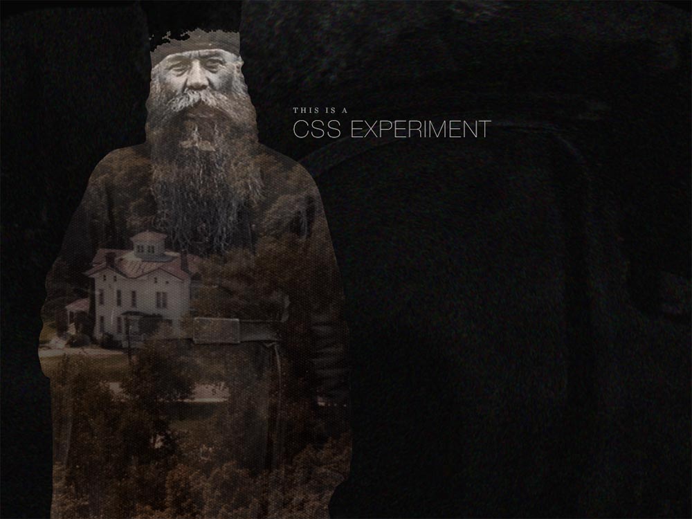
<div class="composition animated">

<div class="town animated"></div>
<div class="human"></div>
</div>
<h1 class="copy animated">
<b class="role">This is a</b> CSS Experiment
</h1>
The containing div element with the class of "composition"
houses all the images. I'm using a containing element here so I can move
and scale the "human" and the "town" together, while still being able
to move and scale each independently. I'm also applying the mask
to the composition element. The "human" and "town" elements have background
images applied to them.
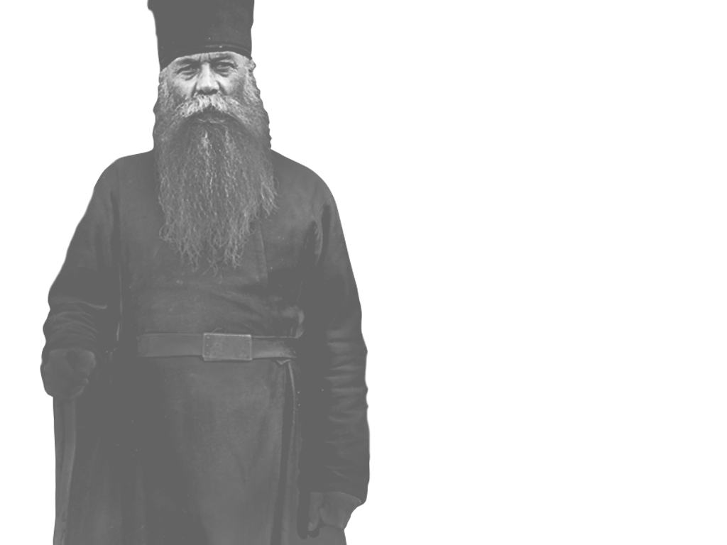
All of the images are from the Flickr Commons. I cropped, clipped, and pushed their pixels around in Photoshop until they felt right. Some of them have kind of ratty clipping paths, but you can't really seen them with everything moving. I was able to bring the file size down some because of that.
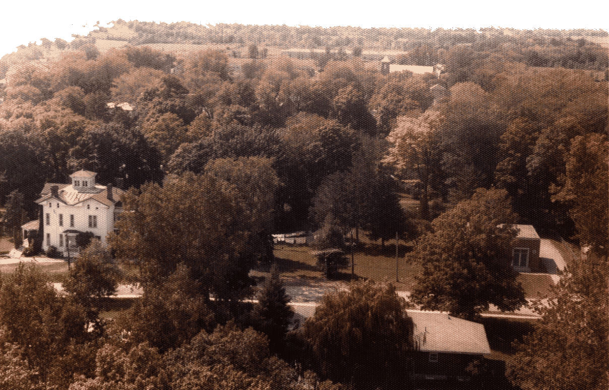
I want to be able to move the "town" element from right to left and left to right. If I applied the mask to that element, the mask would move with the town causing it to not line up properly with the human image. The mask needs to be applied to an element above it, the composition element. Since CSS masks are only concerned with the opaque and transparent portions of an image, I can reuse the human image as the mask for the "composition" element using the CSS below. Areas appearing under opaque portions will be visible, those under transparent portions will be invisible.
.opener .composition {
...
-webkit-mask: url("opener-human.png") top left/cover no-repeat;
mask: url("opener-human.png") top left/cover no-repeat;
}
The shorthand mask has similar properties as background.
URL, position, size, repeat. It was important that all of the images and mask
had the same background-size setting. In this case they
are all set to cover. That prevents the images from becoming
too short or too narrow so that you see the edges of them. I could
have set a fixed width and height on the cards to avoid this
altogether, however it was more fun to embrace the unstable
environment that is a Web browser by letting everything remain fluid.
The rest of the title cards follow a similar pattern with adjustments based on the the number of images that were needed and the animations that were put into place. You can see the source scss for each card here.
There are a few different animations happening during the sequence. The main animation–or timeline–is responsible for cutting from one card to the next and looping back to the first after the last. Within each card there are one or more animations that control composition elements and individual elements.
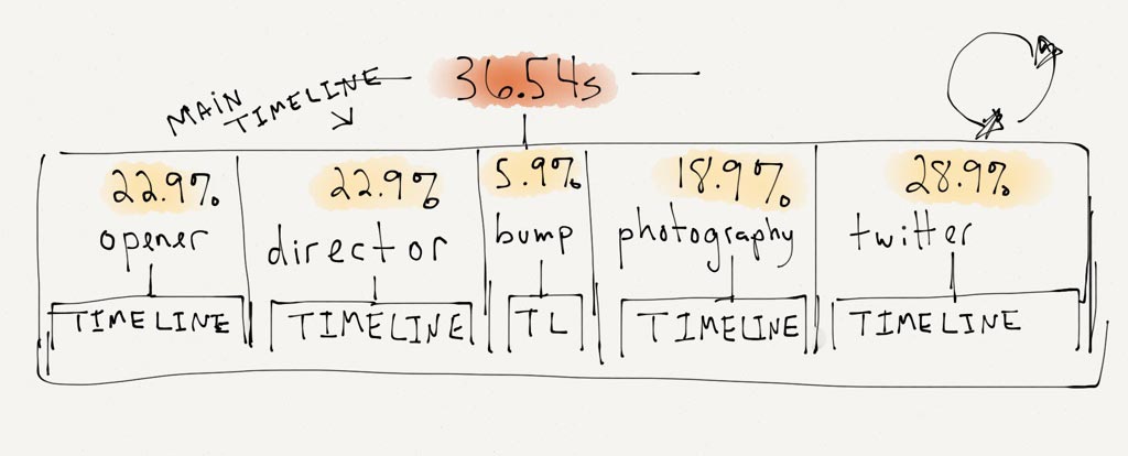
Once I came up with all the cards I wanted, I tweaked the total length until the pacing felt about right at 36 seconds. The .54 seconds was added the to make the sequence length match the length of the audio track. The track ended up an odd length because I edited it with Audacity and I've never been able to tame that beast. Has anyone?
As the diagram shows, the length of each title card is a percentage
of the total sequence length. That length is how long that card will
be visible. Figuring out the length for each card took quite a bit
of trial and error to get right. If each card was the same length, coming
up with a percentage for each would be easy: 100% / number of cards = length.
That was not the case with this sequence.
There are four title cards and one "bump" card.
The bump card contains no text, it's there as a break and
extra visual information (AKA, it looks cool). Because of that, the
bump needed to be shorter than the title cards. The photography card
doesn't contain as much motion as the other cards and that was making it feel too long.
I stole time from it to give to the last card. I wanted the last card with my Twitter info
to be longer than the others.
Each card needs keyframes at multiple positions. I'm going to show the second title card–the director card–as an example, because they get a little strange.
@keyframes director {
0%, 22.9%, 46%, 100% {
opacity: 0;
transform: translateX(-100%);
}

23%, 45.9% {
opacity: 1;
transform: translateX(0);
}
}
I'm going to explain this backwards. Starting at 23% of the main timeline length I want the card to be visible and on the screen. It should stay visible until 45.9% of the main timeline length.
The first set of frames says that the card should be invisible and off screen from 0% until 22.9% and again from 46% to 100%.
I'm using the 0.1% intervals to make sure there is no visible interpolation of the opacity or transform. I want the transition from one card to the next to be a quick cut. The opacity is still interpolating from 0 to 1 and transform from -100% to 0, but it's too fast to be seen.
I'm using translateX to move the invisible cards
out of the viewport so they don't obsure any elements of the current
visible card. That was happening when I was only using opacity.
Again, getting the timing correct on each card was a lot of trial and error. Making changes a percentage at a time. You can see the full scss for the main timeline animation here.

The director card is the most complex card with five separate animations happening simultaneously. Here's the markup for the card.
<div class="composition animated">
<div class="street animated"></div>
<div class="trees animated"></div>
<div class="human"></div>
</div>
<h2 class="copy animated">
<b class="role">Directed by</b>
<a href="https://tylergaw.com">Tyler Gaw</a>
</h2>
Anything with the class of "animated"–you guessed it–has an animation applied to it. The fifth animation is on a pseudo-element. Below is list of each animated element and description of what is animated.
translate.
translate.
::before selector
on the trees element to add an additional subtle detail I called a "blip". It is a
image of fire
that is displayed shortly to give a little more detail to animation.
A quick note on using translate. Always use it to animate
elements on X and Y axes instead of using positioning properties like
left, right, top, bottom. Also try to use it instead of animating
the background-position property. Using translate
gives much smoother animations and uses less CPU. Paul
explains it better than I can.
All of the animations have their animation-direction set
to alternate. I did this so there would be no visible jumps
back to the starting position of the properties. If you watch the
sequence multiple times, you're likely to see the animations running
in different directions.
You can see the full source scss for the director card here.
In the markup there is a class of "animated" applied to any animated
element. I'm using that as way to pause and unpause all of the
animations using animation-play-state.
.paused .animated,
.paused .title-card .animated {
-webkit-animation-play-state: paused;
animation-play-state: paused;
}
There is some light JavaScript to allow the pause/play button to add and remove the class of "paused" from the body element, the CSS above takes care of the rest.
When I was working on this project, I realized there was a lot going on to make it happen, however I didn't realize how much I was on autopilot during the process. Sitting down and trying to explain—in words—what I did was difficult. If you read this far I hope there's a useful technique or trick that you picked up along the way. If not, I hope it was an interesting look into what goes on in my brain when building this type of thing.
Thanks for reading