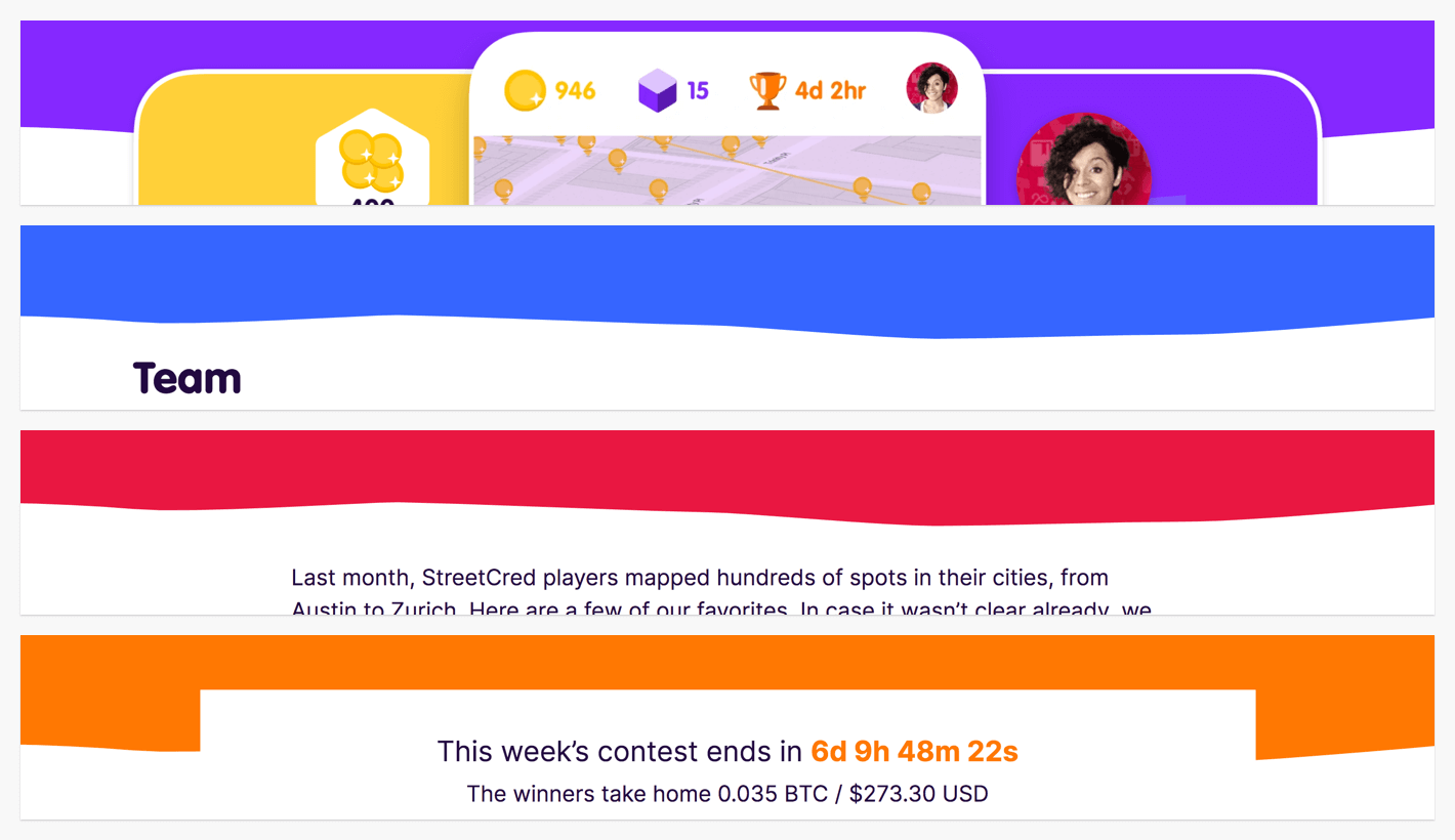
This is a technique I used recently to create a flexible,
repeating pattern using SVG with CSS mask. There are live
examples in this post and they’re available as a
CodePen.
The need came from something I designed at work. I gave the bottom of the header on each page a little squiggle to make it a bit more interesting than a straight line. Along with that, I designed a color system for each type of page. Common pages parade in purple, company content is true blue, blog posts read in red, and contests own orange. With StreetCred I’ve been throwing a rainbow of bright colors to see what’s fun and what sticks.
Along with the current colors, we’re getting ready to ship new features that use even more colors. We’ll make pages for those and they’ll need themed banner squiggles. We need a flexible way to do that.
For the design, I needed a seamless, horizontally repeating pattern. I needed SVG so it was crisp at any size. I wanted a single SVG image that I could color using CSS. Because we could have n-number of colors, creating a new SVG for every color wasn’t a future-facing option. The squiggly banner using this approach is live on streetcred.co. Let’s look at an isolated demo to see how the pieces fit together.
First, I made a quick doodle of a squiggly line in Sketch using the vector tool. The important part was to make sure the line was seamless when repeated horizontally. I did that by making sure the first point and last point were at the same location on the y-axis. And that the bezier curves leading to them was flat when it reached the edge of the artboard. This is a simple shape, so it was easy to eyeball. A more complex design would involve more work.
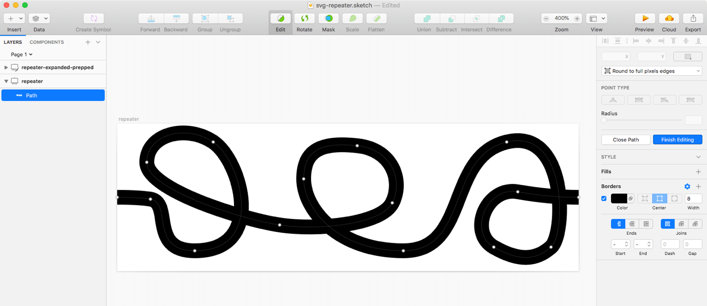
To test if the shape is seamless I just duplicated the artboard and dragged it into place. Nothing fancy again, a quick eyeball is enough for this.
When I create graphics for SVG use, I simplify them as much as possible.
For this, I expanded the stroke. That way instead of exporting a path
with a stroke, I end up with a path with a fill.
In my experience, filled shapes are more flexible when you’re working with them
in browsers. Helps avoid scaling issues with strokes. SVG prep is a
deep topic that I plan to write more about in the future.
Exporting SVG from Sketch leaves a lot of crud in that we don’t need. My next
stop is SVGOMG. After
optimizing we end up with an SVG with a single path element. I
truncated the value of the d attribute for brevity.
<svg xmlns="http://www.w3.org/2000/svg" viewBox="0 0 250 75">
  <path id="squiggle" d="M12 19.778C12 1.318..." />
</svg>
We’ll use the id attribute as a reference in CSS. Notice we don’t need
presentational attributes like fill. SVG provides the
shape. CSS handles the color.
The HTML is a single div. The CSS is three properties.
<div class="repeater"></div>.repeater {
background-color: red;
/* This fixed height is only for demo, your use cases might not need it */
height: 75px;
mask-image: url("/path/to/repeater.svg#squiggle");
}
As of this writing, this CSS works in Firefox, but not in Chrome, Safari,
or Edge. WebKit/Blink browsers still require vendor-prefixed mask
properties. We don’t want to have to repeat the path to the image. Let’s store
it in a custom property to make it reusable.
.repeater {
  background-color: red;
  /* This fixed height is only for demo, your use cases might not need it */
  height: 75px;
  --svg: url("/path/to/repeater.svg#squiggle");
  -webkit-mask-image: var(--svg);
  mask-image: var(--svg);
}
With the prefixed version of mask-image in place, this works in all current
versions of Chrome, Firefox, Safari, and Edge.
mask-image
is doing the heavy lifting here. We’re giving it a reference to an external
SVG file and the id attribute of the path we want.
Mask is hiding anything in our div that doesn’t intersect
with that shape. So we see the background-color only where the
path is.
mask is like CSS bacground. It has a mask-repeat
property that defaults to repeat. Check the MDN docs
for more that.
With a functional foundation in place, we can have fun with it. We can style the underlying div any
way we want to create different effects. We can change the color.
.repeater--orange {
  background-color: orange;
}We can take that further by setting a background image.
.repeater--gradient {
  background: transparent linear-gradient(90deg, red, purple, blue, green);
}
Changing the background color and image is fun, we can also change the height
of the div to produce something different.
.repeater--sized {
  height: 18px;
}
We can change the color, bacground-image, and height. Let’s introduce the
mask-size property to squish the SVG into a type
of texture.
.repeater--textured {
  --texture-lines: 10;
  --mask-size: calc(250px / var(--texture-lines));
  -webkit-mask-size: var(--mask-size);
  mask-size: var(--mask-size);
}
Again, we’re using a custom property to not have to repeat the size value. We’re
using calc here as a convenience. 250px is the height
of the viewbox of the SVG. We divide that by the number of rows
we want to make sure we don’t have partial rows.
We can also change the position of the mask using mask-position.
And, if we can change a value with CSS, that means we can change it over time.
Change over time equals motion.
@keyframes move {
  to {
    --pos: 150%;
    -webkit-mask-position: var(--pos);
    mask-position: var(--pos);
  }
}
.repeater--animated {
  animation: move 0.6s infinite linear alternate;
}These are toy examples, but they show that with a few building blocks we can construct a lot of variations. With more complex SVG images and more CSS, we can use this technique to produce all sorts of fun stuff. And be future-flexible while doing it.