Designing Anthologies: Initial Concepts
Another day, another side project. My latest is Anthologies. It lets you package links to share stories. Or–more accurate–that’s what it will do when I launch it. I bought the domain name two months ago and now I’m getting to work. I plan to share as much of my design and development process as possible. This post is a look at early design concepts and a peek into my thoughts on how I approach a new design.
First things first. If this idea sounds familiar, it’s because it’s been a thing before. In 2012, when I was on the Readability team, we designed and built Readlists. Readlists shut down in 2016. It happens. But I miss it and I know other people do to. I don’t think it’s a huge number of people, and that’s OK. My goal for Anthologies is to build a small tool that does one thing well. If only a few people use it, that’s A-OK with me. And much cheaper. (I plan to write about my approach to building this in a cost-efficient way as soon as I figure out how to do that. I’m following the serverless path right now.)
MVP
At its core, an Anthology is a title, description, and list of urls or “entries” as I’m referring to them. For the MVP, I’m also going to expand that to include details about each entry as they’re available. Each entry can have a title, excerpt, author, publication, and image. If each entry has those or not will depend on the contents of the page at the url. I know from experience that parsing pages for those details is unpredictable. So my design needs to be flexible.
Systems Check
Like a lot of designers, I sit down and get right to work on a new design by staring at fonts for an hour or two. For Anthologies, I wanted what I usually want from a typeface. I wanted sturdiness at small sizes and a good range of weights. I wanted a super heavy weight for stand-out titles. I also had a specific type hang-up this time around; I wanted a typeface with a two-story lowercase “g”. In early logo and UI sketches I kept drawing two-story g’s so I had it stuck in my brain and didn’t see a reason to fight it. I settled on Aaux Next. It has a beautiful two-story g. So far I’ve used the regular, medium, black, and ultra weights.
Another way I like to put off designing is to fiddle with grid configurations. Sketch makes this way too easy. After the proper amount fiddling, I landed on a grid that seems to work well. The grid is seven–191 pixels wide–columns with ten pixel gutters. I set row gutters at twenty pixels, and every now and then actually set text on them the right way.
If you’re looking at the grid image you might notice it’s off-center to the right. That’s on purpose. You’ll see later that each mock-up includes a banner with branding on the left. I didn’t want that to use the grid. I only place the primary content on the grid.
The Concepts
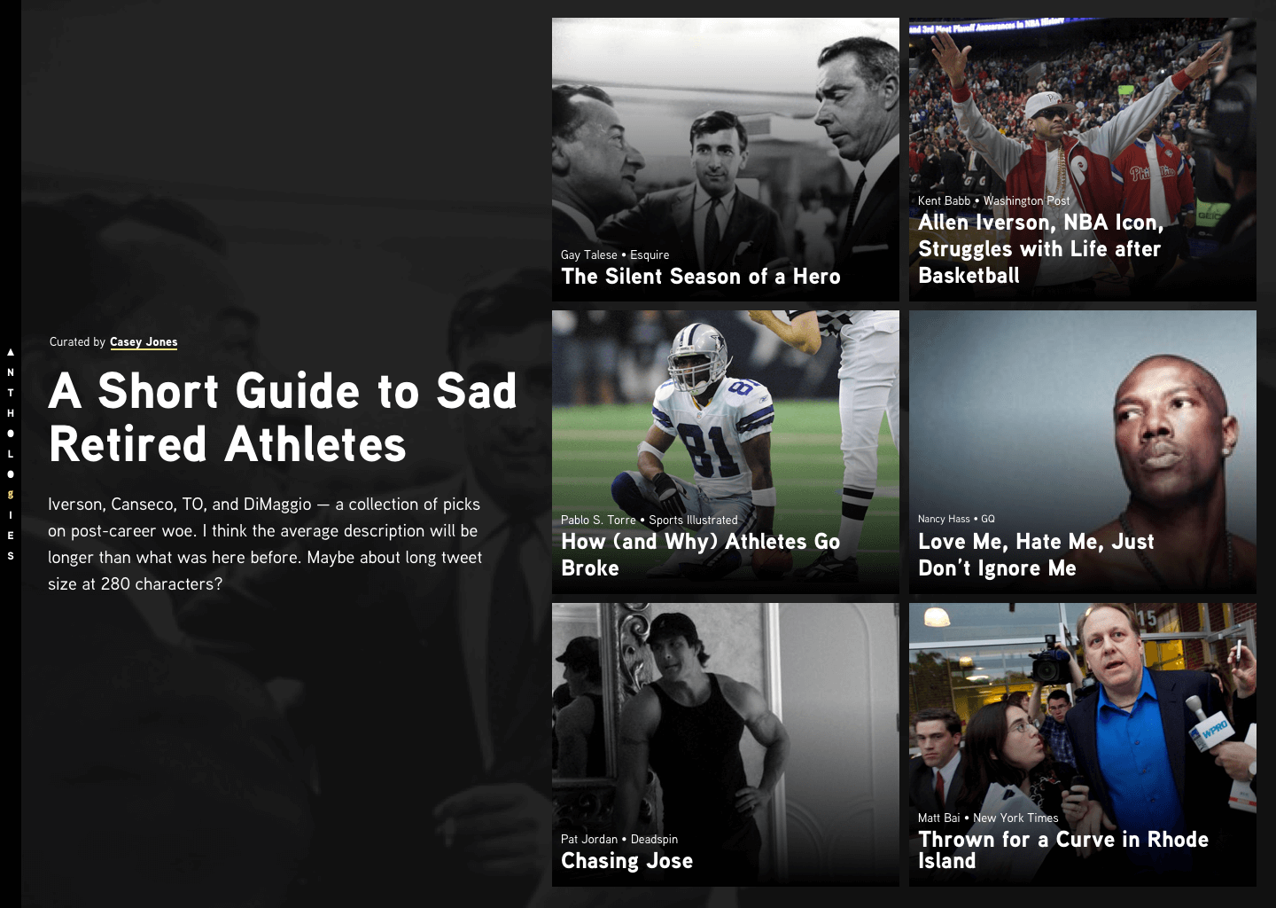
With ample procrastination out of the way, I started designing. For content, I used The Longform Guide to Sad Retired Athletes. Their collections are a perfect match for the type of content I expect will make up most Anthologies.
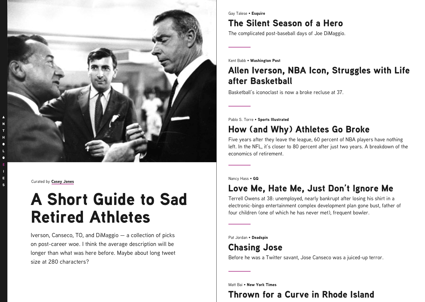
1. Two-up
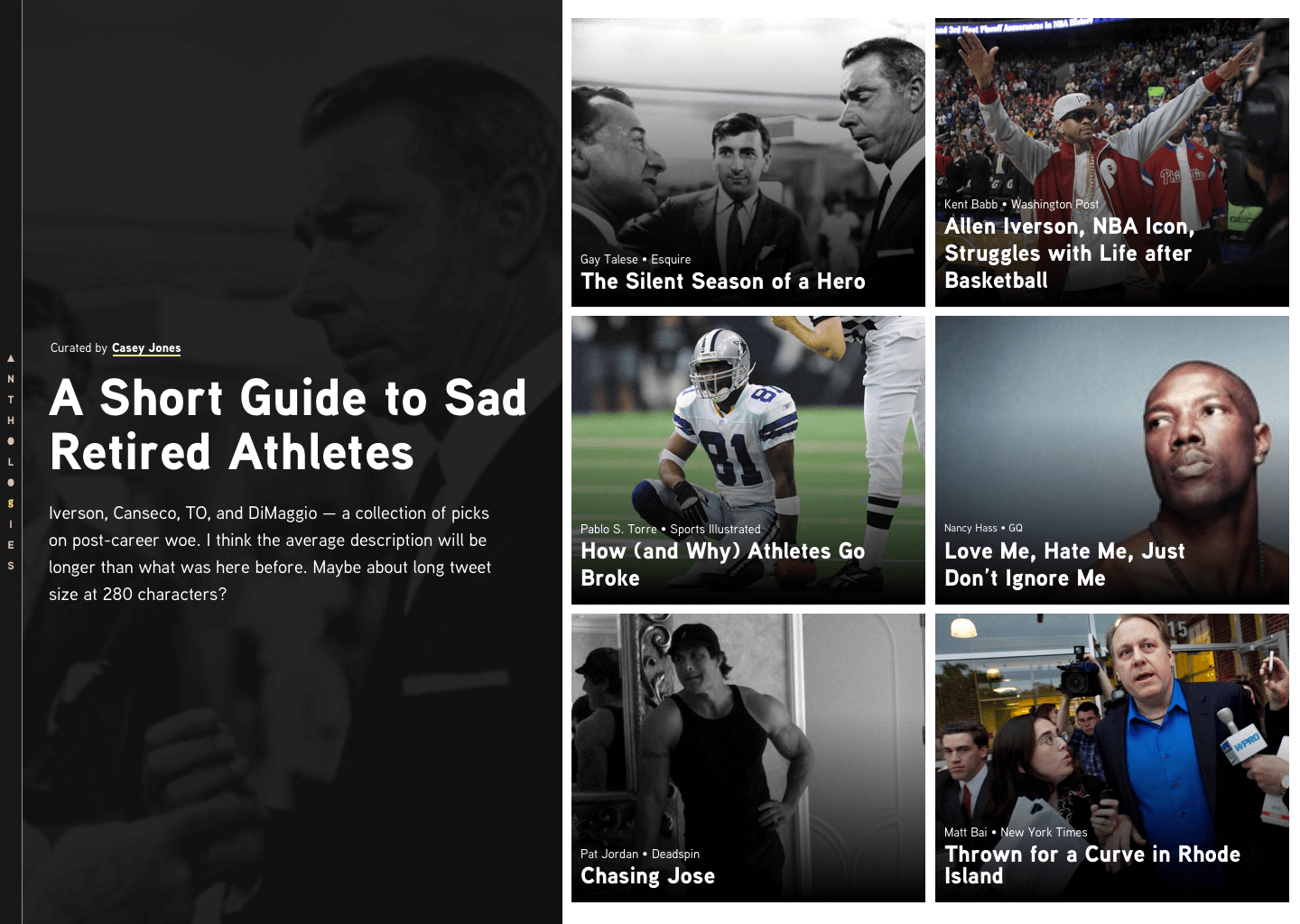
The first go at it. A lot went into this that you don’t see in the mock-up. Much shuffling of text and images happened to get to this point. I don’t know that this is “good”, but it felt like a complete thought. It felt resolved enough. It displays the Anthology content and provides links to the articles. It accomplishes the goals.
The most valuable artifact of this iteration are the discovered interface patterns. These are building blocks for every later iteration. There’s a “cover”–made up of the title, description, and byline. The entries–made up of individual entry elements. And within those are smaller components. I think about these in Atomic design terms. The cover is a organism. It includes an “intro” molecule. The intro contains title, description, and byline atoms. And so on. These might not be the exact elements I end up with, but they’re a way for me to break down the interface into distinct parts. Finding interface building blocks is a goal of my early design process.
An Organized Tangent
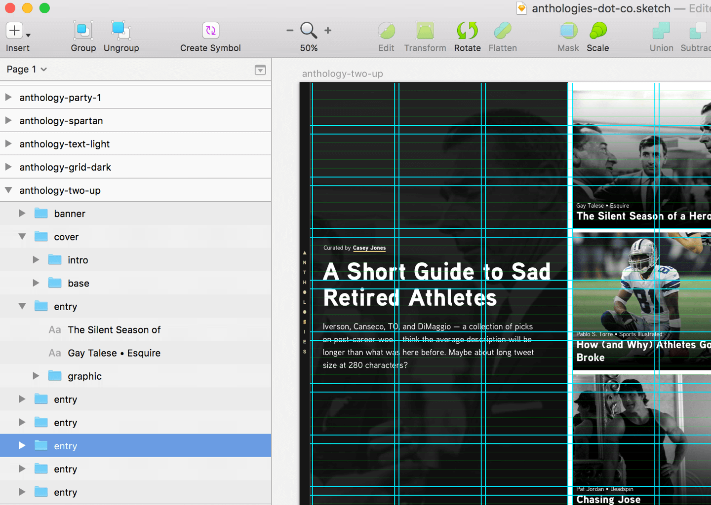
Keeping my artboards, groups, and layers organized in Sketch helps me focus. Naming those items also helps me get a jump on naming elements in HTML and CSS. The names I use in Sketch, I’ll use for future class names, file names, etc. When I look at the Sketch layers palette, I see the DOM.
The name of each design concept is the name I gave the artboard in Sketch. Those names might not stick and aren’t always descriptive, but they help me organize my thoughts.
The first iteration is always the hardest. With it out of the way I started having a lot of fun with the designs. The rest of the concepts are me asking; “what if…?” and then designing answers. These aren’t meant to be separate themes to choose from. They’re exploration of possibilities. It’s me searching for interesting ways to display the same content. In that searching I find design solutions, but also more questions that lead to more design. This was also just good, fast design fun. I could do fifty of these and keep going. I won’t though, because I want to ship this thing sooner than later.
2. Grid Dark
This was a tiny step from the first concept. A little more modern, techy aesthetic. Instead of cropping the cover image, I let it fill the layout, and let the entries float above the background. A joke name I had for it was “Textflix”, because it reminded me of Netflix’s aesthetic. I’m light on words for this one because I think it’s just…fine. I could ship this and it’d work, but it doesn’t really move the needle for me. It invokes a healthy shrug.
These first two iterations were dark and felt heavy. For the next concept I lightened things up in color and design elements.
3. Text Light
Along with a lighter aesthetic, in this concept I changed grid usage. In the first two concepts, I gave the cover three columns and the entries four. In this concept, I gave the cover image more prominence. When I saw that, it felt like it needed room to breathe. With that, I gave it another half column and reduced the entries to three-and-a-half columns.
Content-wise, I introduced entry excerpts. The layout of the first two concepts worked better without excerpts. It feels a bit off to exclude them for entries though. It seems like the reader needs a bit more of a hook to decide where they want to start.
In the future, excerpts could be curator-configurable per Anthology.
4. Text Light Imgs
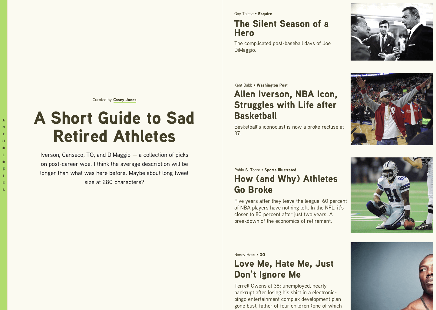
This was the first concept I tried using an image for each entry. When I saw them in place, it felt like the cover image could go away. The title and description could shoulder the work of being the cover.
For this concept I also tried an off-white background color. I pulled this from Readability, Instapaper, Pocket, et al. In those, a similar color tended to be used for a sepia theme. I’m luke-warm on it.
I explored options for the branding banner here too. I wanted to see if a stark contrast between banner and content could help the banner detach and fade away. Sometimes when an element is so much different than the rest of the design, it can make it easier to consider it, then ignore. I’m still not sure if it’s working or not, but it’s interesting.
5. Text Light Two
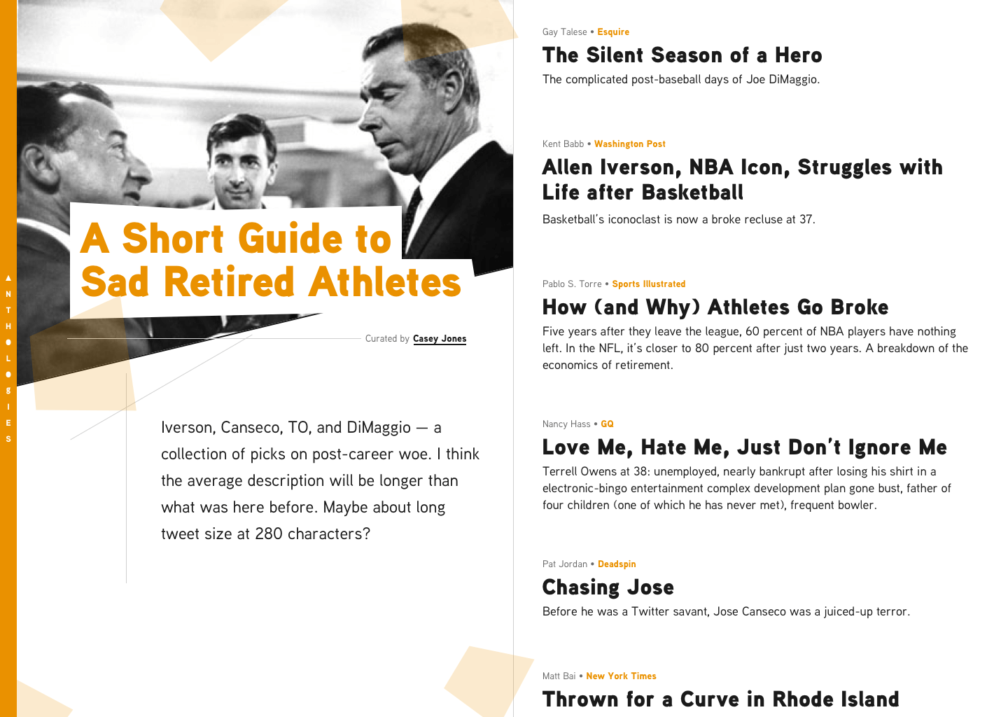
In this concept, I let myself toss around more design elements. Scattered orange blocks here, a few tech lines there, an angle on the cover image, and so on. With the orange blocks, I was thinking about something like a 1970s jazz album cover. Or at least how I pictured them looking. I also switched the title and entry headings to the Ultra weight of Aaux Next. They felt like they needed some extra heft.
With the introduction of more design elements, it felt like the eye needed a little break. To give it that rest, I removed the image thumbnails for each entry.
6. Spartan
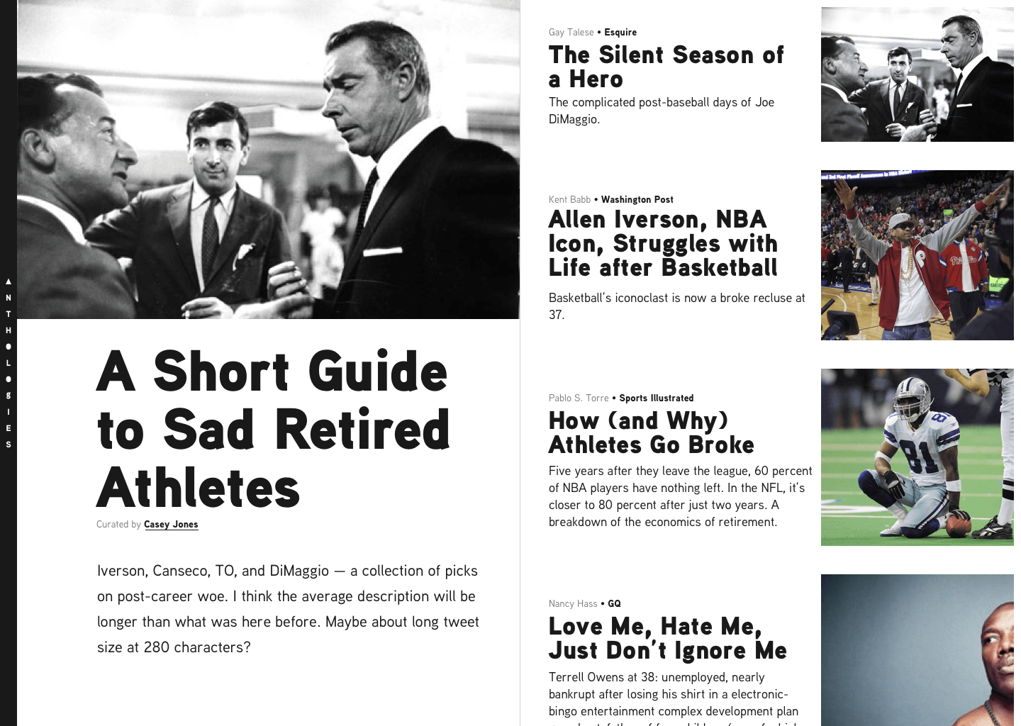
After Text Light Two with all its fiddly bits, I wanted to try one the other way. For this concept I let the content speak for itself. Text and images as content with–almost–no other design elements. I kept one element in place, the subtle border between the cover and entries. You might also notice I increased all the font sizes. The title and each entry title felt like they needed more oomph to take center stage. I was looking at–and taking cues from–the New York Times on this one.
At this point, this concept feels the strongest in terms of practicality and broad use. When I start building, I’ll most likely use this as a guide.
7. Party
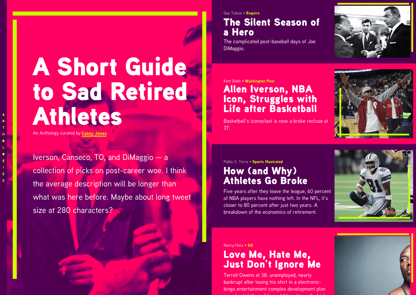
Oooooh shit, here we go! I needed to see one like this. I took about a day break between Spartan and this concept to clear my head. Then I threw everything at the wall. I’ve been reading posts on The Outline and enjoying the design they’re doing. I lifted ideas wholesale from them on this concept. That’s a fun thing about doing early concepts like this, it’s OK steal. It’s more about serious play than producing a finished piece.
I don’t know if a concept like this will make it to browsers, but it could. I don’t think it’s “bad.” Depending on the tone of the Anthology, something like this could work well. I plan to explore this type of aesthetic more as I go.
HTML/CSS Here We Come
Designs like this are never “done”, but this one is ready for the next step: browsers. Using Spartan as a base, I’ll build an Anthology page using static-content. As soon as you get in a browser you learn a ton. The design will shift and shimmy from the static mocks here to meet the needs of its ultimate home.
As I mentioned before, I have more posts I want to write about my process. When I dive into these projects I let myself get pulled into the weeds in myriad areas of design and development. It’s tons of fun and it’s important to share. Keep an eye out for more.
This post is also available as Markdown. If you have thoughts or questions about it, find me on Bluesky, Mastodon, or email me@tylergaw.com.