A Small Redesign with a Little Sugar
Take aways: Look at this site and fork this code if you don't feel like reading.
Since reading Responsive Web Design by Ethan Marcotte I've been chomping at the bit to design a site using all of the fancy things written about in that little, yellow, different book. To really take those new ideas and techniques for a ride I needed a small project to work on where I could just go crazy and try every new thing I could pull out of the book and my brain. Luckily I have a never-ending stream of personal projects that can always use a little TLC. The project that I picked to revamp is a small one page site for a jQuery plugin that I wrote last year, Jribbble. The site is quick overview of the methods that the plugin makes available, documentation of those methods and some working demos.
The design process
Before starting a design I like to set some rules for myself. These aren't hard and fast rules, just some general thoughts that I keep in mind to guide the process and keep myself in check. The rules for this design were nothing outlandish, the design should:
- Use a flexible grid that remains comfortable from 320px to 1280px in width
- Be designed mostly in the browser with CSS, limited Photoshop work
- Not use any gradients
- Not use any Photoshop noise!
- Have some bits of CSS "sugar"
The last rule, "sugar", I think of as something extra, something possibly new, that you might not see that often. I'll talk about it more later.
The first graphic I envisioned for the design was the name, Jribbble. I saw the "J" and the "b"s in a large, swooping style. A style that I would not be able to accomplish with a computer. I would need to use my hands. The vision I had for it was too large for a pencil or pen or marker. I grabbed my box of acrylic paints, brushes, my 14" x 17" drawing pad and spread them out on my definitely-not-for-painting-on Ikea coffee table. With a medium sized brush and Primary Magenta I scrawled out a couple of "Jribbble"s as well as some random strokes. The toothbrush you see in the photo I used for making paint spatters and for getting paint all over the damned place.
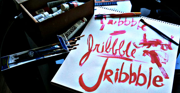
After the painting I took the "Jribbble" I liked most into Photoshop and fiddled with it a bit. I isolated the color from the background, applied the Twirl filter a few times to give it more character and added some of the random strokes and splatters around it for a more haphazard look. In Photoshop I set up a 958px, 12 column grid to work off of. For the banner and assorted page headers I selected Botanika Mono Web from Typekit. I don't own that font so I have to use a very advanced and elegant method for playing around with initial type layout. I input the text I need into Typekit's Type Tester and take screenshots of the text from there. See, fancy ain't it?
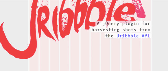
The image above is the extent of the design accomplished with Photoshop. From that point on the rest of the design was created with good ole' CSS. Just like I have always done in Photoshop I went through quite a few style iterations; colors, type sizes, positioning, but instead of spending that time in Photoshop and only moving to the browser when it was "final" I used the medium that would be delivered to create the design. Designing in the browser, it feels good man.
The flexibility
To accomplish my flexible grid, I started with a overall width of 80% on the content area. That number was somewhat arbitrary, I started with 100% and decreased the number until I felt there was a comfortable amount of room between the edge of the browser and the beginning of the content. I am setting a max-width of 1280px on the content area. Any wider than that and things started to get a little unwieldy; line-lengths were too long and in general things just didn't look good. At browser widths of 768px or narrower I wanted to gain back some of the margin so I used a media query to increase the width to 95%.
#content {
margin: 0 auto;
max-width: 1280px;
width: 80%;
@media screen and (max-width: 768px) {
width: 95%;
}
}
Quick note on the media query. I'm using Sass which allows for nested styles. You'll see more of this in later code examples.
In a number of areas of the design I use a two-column layout. To determine the widths of each column I used the oh-so-helpful formula that Ethan describes in RWD:
target ÷ context = resultFor the columns I use the starting width of 958px as a context then determine a pixel value based off the width of each of my grid columns, 69px, to come up with widths like:
.method-description {
h3 {
float: left;
width: 40.1878914%; /_ 385 ÷ 958 = .401878914 _/
...
}
p {
float: right;
...
width: 56.4718163%; /_ 541 ÷ 958 = .564718163 _/
}
}
More on media queries
Throughout the design I used media queries to add more fine tuning of styles that I couldn't accomplish with percentages alone. I decrease font sizes, switch to single column layouts and make other miscellaneous tweaks as the browser width decreases or increases to specified break points. For cross browser media query support I used the Respond.js poly fill. It works great, media queries in IE7, you can't beat that with a stick! I needed to make some specific enhancements based on features as well so I used Modernizer for feature detection. I included Respond.js in my Modernizer build.
The good stuff, the sweetness, the sugar
How does a die-cut, scaleable background image sound? I thought it sounded pretty rad. I'll explain. I had the idea that I wanted the "Jribbble" graphic to be different colors at different times. One way to accomplish that would have been to make a number of different images in the various colors that I wanted. That would work, but I thought I could do it a more efficient way. What I did was create an image that had a set background color of #ececec with the text itself transparent allowing for a background color to show through.
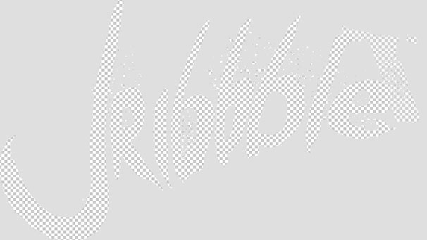
With die-cut taken care of, let's look at scaleable. At its base size of 1149px by 663px the logo graphic is pretty large. At medium to large browser widths, this works fine, as the browser width decreases or increases the graphic starts to lose its intended effect and also starts to cause readability issues for other page elements. background-size to the rescue!
#bigAssJribbble {
background-image: url(../images/branding-die-cut.png);
background-repeat: no-repeat;
background-position: 15% 100%;
-moz-background-size: 190% 140%;
-webkit-background-size: 190% 140%;
-o-background-size: 190% 140%;
background-size: 190% 140%;
padding-top: 45%;
position: absolute;
width: 100%;
}
A couple things are going on here. It's important to note that the branding-die-cut.png image is much wider than it needs to be. The graphic is flush left and the right side extends ~1049px and is filled with our background color #ececec. I do this so I am able to position the background image off the left side of the browser and not leave a gap on the right side. If there was a gap that the image didn't cover, any background color would show through where I didn't want. The width of the element is set to 100% so it is always the size of the browser. The background-size property does exactly what it says, it scales the background image to the percentages that I used. There isn't a science to those numbers, I just tweaked them until they looked right.
Another cool thing in that block of CSS is the padding-top. Since an element has to be taller than 0px for a background image to show and I didn't want to set an explicit height due to the changing graphic size I used the percentage padding to give the element a height. Again, no science with that number, just changed it until it worked.
Something that's not accounted for in the above CSS is the background color, the color that should show through the die-cut image. This is where I started having a lot of fun. I set up 11 media queries at different pixel max-widths from 320px to 2360px, at each of those I set a different background color for the logo as well as a number of different elements on the page. As the browser width increases or decreases the background color changes. Another little extra I use is a CSS transition to smoothly change from one color to another on each of the chameleon-like elements. An example element with a media query colorway:
#bigAssJribbble {
-moz-transition: background-color 0.2s;
-webkit-transition: background-color 0.2s;
-o-transition: background-color 0.2s;
transition: background-color 0.2s;
}
@media screen and (max-width: 480px) {
#bigAssJribbble {
background-color: #4400ff;
}
}
I didn't get incredibly specific with what colors I chose. I started with a base of #ff0066 and then apply cooler colors as the width decreases and warmer as it increases.
That's CSS sugar in my view. It's not something that everyone will see, but it's just a little extra for those that are looking and into that sort of thing.
That's all
All in all a very fun process full of experimentation and learning for the sake of experimentation and learning. It probably took too long, so it goes. Side projects live in the off hours, the small windows of time before and after the "real" work and in the hours when you probably need to be sleeping.
Again, the completed site lives here http://lab.tylergaw.com/jribbble and if you're interested in more of the code, fork it from its Github repo https://github.com/tylergaw/jribbble.com.
Thanks for reading